Redesigning a Brand Icon
What Milka and Nestle represent globally, Najlepše želje represents on the Serbian market. Working on our favorite brand across generations, we created a new packaging that embodies the most valuable element - that unforgettable taste of chocolate from our childhood days.
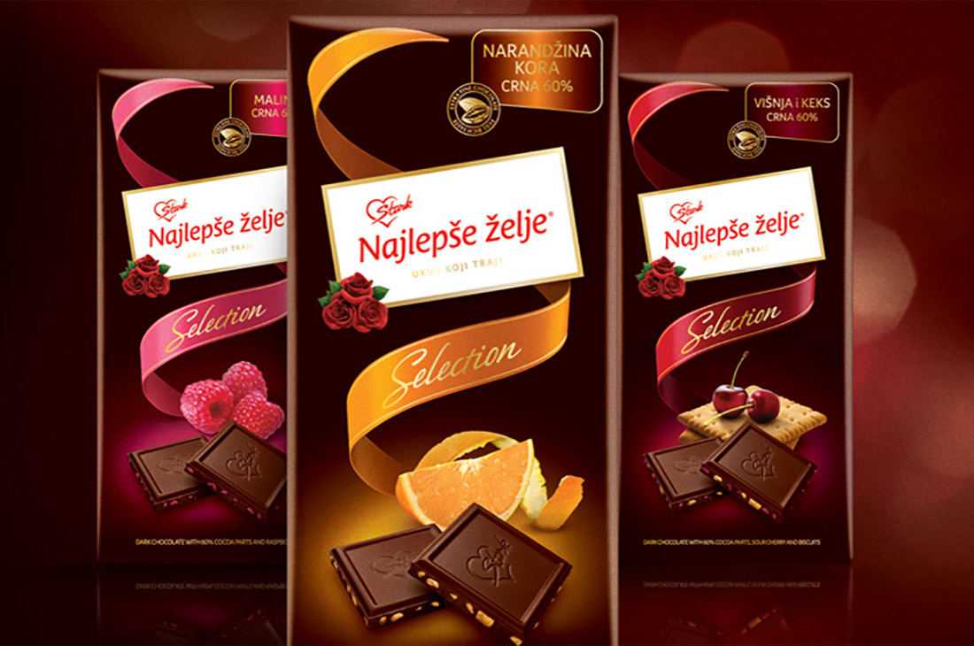
SOKO ŠTARK NAJLEPŠE ŽELJE


During our many years of cooperation with Soko Štark, we developed numerous significant projects. One project that we particularly enjoyed was the redesign of the iconic Najlepše želje brand. Although consumers still perceived it as an authentic brand and one of the leaders in the category, insufficient monitoring of market trends and marketing activities led to a significant decline in sales and loss of market position. Our task was to breathe new life into the Najlepše želje brand by rejuvenating and refreshing the visual identity, and highlighting every aspect of the brand's unique heritage, thereby affirming its iconic status.
Given the exceptional brand awareness and its basic graphic elements, the redesigned packaging introduced significant innovations with the utmost respect for all the features that make this beloved brand recognizable. A brand device was introduced as the basic element of harmonization within the product portfolio, as well as a new contemporary product display. Contemporary brand architecture and refined packaging design enhanced the visual presence at the points of sale and communication with consumers, paving the way for the introduction of new flavors, products and formats.